My friend, Marc Maxson, has a gift for aesthetically-pleasing visual representations of complex data. In this blog post, he shows the inequality of wealth distribution across the globe. “Where does the Money Go?” would indicate how broken the international aid system is. As an example, the Nigerian state has lost more money lost to graft and corruption since 1960 than it is has ever received total in international donor funds. Clearly, Nigeria does not lack money, it lacks an accountable system with responsible leaders that stop politicians from looting it all.
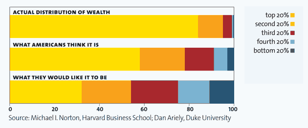
Another great source of artful data display can be found on informationisbeautiful.net. “What are the Wall Street Protesters so Angry About?” shows that the U.S. ranks just under Cameroon and Iran in terms of fair distribution of wealth. Many developing countries without the American institutions of financial regulation actually have far greater wealth equality than the United States, e.g. Uzbekistan, Turkmenistan, Venezuela, Burundi (and yes, Nigeria too). The paradox is that these countries listed are all ranked by Transparency International (TI) as the most corrupt in the world. Although one could argue that it is easy to have equal distribution of wealth when everyone in a country lives on a dollar a day, there is also something very wrong when the top 1% have 43% of financial wealth, and actually get richer during an economic meltdown. Somehow, I think that runs counter to the ideals of American democracy, a country purportedly “very clean” on the TI index.
Related articles
- Why Do Americans Accept Wealth Inequality? (psychologytoday.com)
Here are some of my favorite infographics to explain the real gaps between wealthier and less wealthy, and our collective misconception about it:


